In today’s technological age, users access web content through an array of devices, and having a responsive web design is not just an option – it’s a necessity. Responsive web design (RWD) has revolutionised the way we approach web development, enabling websites to seamlessly adapt to various screen sizes and resolutions.
In this comprehensive guide, we will delve into the world of responsive web design, exploring its impact on SEO and user experience, its fundamental principles, and best practices to ensure your web pages render well across all devices. Whether you’re new to web design, an experienced designer or developer, or a website owner looking to optimise your online presence, this article will equip you with the knowledge and skills needed to design a responsive and user-friendly website.
Table of Contents
What Is Responsive Web Design?
Responsive web design is an approach to web design and development that focuses on creating web pages that adapt and respond to different devices and screen sizes. It is a design approach that aims to provide a better experience by ensuring that your website looks and functions seamlessly across a variety of devices, including mobile devices, tablets, and desktops. A responsive website design ensures that your content remains easily accessible and visually appealing, regardless of the device your users are using to access it.
SEO and UX: Why Responsive Website Design Matters
Responsive web design is not just about aesthetics – it has a significant impact on both search engine optimisation (SEO) and user experience (UX). As of January 2023, mobile devices accounted for 57% of global internet usage according to Statista. This underscores the necessity of ensuring your website is optimized for various screen sizes and resolutions.
Search engines like Google favour mobile-responsive websites in their rankings, making responsive design a crucial factor in your website’s visibility. When your website is optimised for mobile devices, it tends to load faster, improving your page load speed, which is a critical ranking factor in search algorithms. Additionally, a responsive design makes it easier for search engine bots to crawl and index your web pages, ultimately leading to better search engine rankings.
Search engines like Google favour mobile-responsive websites in their rankings
From a UX perspective, a responsive design ensures that visitors can access your content and navigate your site effortlessly, regardless of the device they are using. A study by Google found that 48% of users feel frustrated and annoyed if a website isn’t mobile-friendly, highlighting the significance of a mobile-friendly design in retaining visitors. The majority of website traffic comes from mobile devices, and users have high expectations for a seamless browsing experience. A mobile-friendly, responsive design enhances user satisfaction, reduces bounce rates, and increases the likelihood of user engagement and conversions.
How Does Responsive Web Design Work?
To create a responsive website, web designers and developers craft flexible grid layouts that automatically adjust based on the size of the screen and resolution. Designers adopt a method of web design that embraces a fluid design structure, where elements on the webpage are proportionally sized and positioned based on percentages rather than fixed pixel values. This approach allows the layout to adapt smoothly as users resize their browser windows or switch between different devices.
HTML and CSS Fundamentals for Responsive Layouts
To design a responsive website, you’ll need a solid understanding of HTML (Hypertext Markup Language), which structures the content of webpages, and CSS (Cascading Style Sheets), which controls the presentation and layout. These are the building blocks of web design, and mastering them is essential for crafting layouts that work across different devices. Use HTML elements to structure your content, and apply CSS styles to control how it’s presented. For example, you can use HTML tables or CSS Flexbox to create a dynamic grid that adjusts to differently-sized screens.
Media Queries and Responsive Breakpoints
Media queries allow designers to apply specific styles to various devices based on the viewport size. A viewport refers to the visible area of a webpage within a browser window. With media queries, you can define responsive breakpoints – specific screen sizes at which your design layout adjusts to provide an optimal viewing experience.
Media queries allow designers to apply specific styles to various devices based on the viewport size
For instance, you can use media queries to specify that your website’s layout changes when the viewport width falls below a certain size, such as 768 pixels. At this breakpoint, you might opt for a single-column layout, which is more suitable for mobile devices. By strategically setting breakpoints, you can ensure that your website looks polished and professional across a range of devices.
Understanding the Viewport for Responsive Design
The viewport is a critical concept in responsive web design. It refers to the area of the webpage that is visible to the user, and it can vary depending on the device and browser’s window size. To use a responsive design that accommodates different viewport sizes, you can set the viewport meta tag in the HTML code of your webpage.
The viewport meta tag allows you to control how the website is initially scaled and sized to fit within the user’s device screen. By using this tag, you can prevent users from needing to zoom in or out to view your content, ensuring an optimal experience for users from the moment they land on your site.
Creating Responsive Images for Better UX
Images play a crucial role in web design, and ensuring they look and perform well across various devices is an essential aspect of responsive design. Images that are not optimised for mobile devices can slow down page speed and negatively impact the experience of users. To address this, designers use a variety of techniques to create responsive images.
One approach is to use the HTML img element and the srcset attribute, which allows you to provide multiple image sources with different resolutions. Browsers can then choose the appropriate image based on the user’s device and size of the viewport, ensuring that the image maintains its quality while reducing load times.
Best Practices for Responsive Designs
Creating a successful responsive web design involves more than just adjusting layout and images. Here are some good practices to keep in mind:
- Mobile-First Approach: A popular web design trend is to start designing with the mobile version in mind and then progressively enhance the design for larger screens.
- Use of CSS Media Queries: Employ CSS media queries to define breakpoints and apply styles tailored to various devices.
- Flexible Grids: Create a grid layout using relative units like percentages to ensure elements adapt smoothly to different screen sizes.
- Font and Text Size: Use relative font units to ensure text remains legible across various devices without requiring users to zoom.
- Optimised Page Load Speed: Compress images and minimise code to improve page speed and enhance the experience of users.
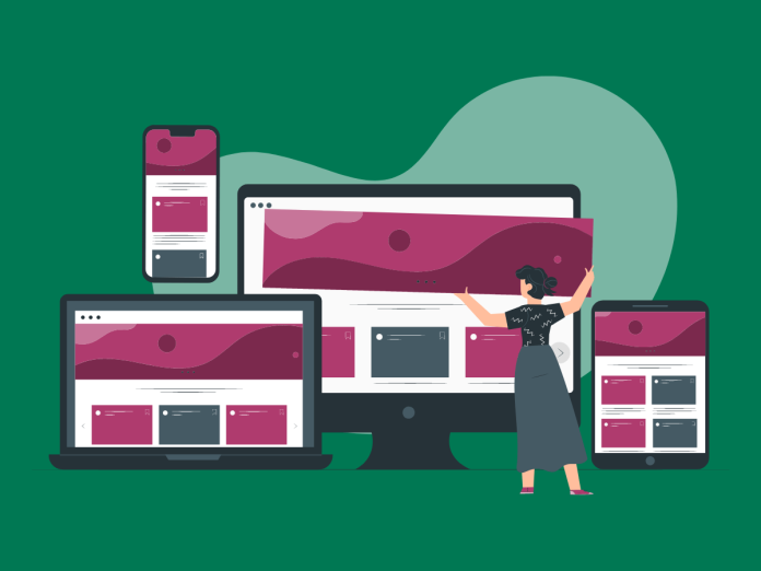
Design Examples: Tablet, Mobile Phone, and Beyond
To illustrate the power of responsive design, let’s take a look at some design examples across various devices:


FAQ for Responsive Web Design
What is responsive design?
Responsive design is an approach to web design that aims to make web pages render well on various devices and screen sizes.
How can I make my website responsive for mobile?
To make your website mobile responsive, you can use CSS frameworks like Bootstrap that provide responsive design templates and components. Additionally, you can use media queries and adjust the font size, layout, and container element sizes based on screen and window sizes.
Can you provide examples of responsive web design?
Examples of responsive web design can be found all around the internet. Some popular websites that use responsive design include MCloud9, Amazon, Google, and The New York Times. These websites seamlessly adapt their layouts and content to various devices and screen sizes.
How do I edit the design and layout of a responsive website?
To edit the design and layout of a responsive site, you can modify the CSS code and adjust the properties and values related to responsiveness. By targeting specific media queries and selectors, you can make changes to the design based on many screen sizes and devices.
What is the difference between responsive web design and mobile app development?
Responsive web design refers to adapting website layouts to numerous screen sizes and devices, while mobile app development involves creating standalone applications specifically for mobile. Responsive web design is focused on making the website accessible across multiple devices, while mobile app development allows for more mobile-based functionality and a customised user experience.
In Conclusion
Responsive web design is a game-changer in the world of web development. Its ability to seamlessly adapt to various screen sizes enhances the user experience and boosts search rankings. By utilising HTML and CSS fundamentals, media queries, and a mobile-first approach, you can create a website that looks and functions beautifully across a range of devices.
As a web designer or developer, mastering the art of responsive design is essential for staying ahead in today’s digital landscape. It’s an approach that MCloud9, a reputable web hosting and domain registration company, utilises in its own website design. Remember, responsive web design is not just a trend – it’s a fundamental aspect of creating websites that thrive in a diverse and ever-evolving online ecosystem. So, embrace the principles of responsive design, optimise your website for a variety of devices, and watch as your search rankings and user engagement soar.
