
If you’re a web designer or developer looking to enhance your skills and create visually stunning web pages, then you’re in the right place. In this comprehensive guide, we’ll dive into the fascinating realm of Cascading Style Sheets, commonly known as CSS, and uncover the magic behind creating captivating web designs. Did you know that 38% of users will stop engaging with a website based on its design? Visual appeal plays a crucial role in capturing user attention and creating a positive first impression. Whether you’re just starting your journey or you’re looking to refine your skills, understanding CSS is crucial to achieving pixel-perfect designs and responsive layouts.
Table of Contents
What Is CSS (Cascading Style Sheet)?
Imagine you have a blank canvas – that’s your web page. Now, picture yourself adding colours, fonts, and arranging elements on that canvas to create a beautiful masterpiece. CSS is your artistic toolkit that allows you to bring your web pages to life with stunning visual elements. In essence, CSS is a design language used to define how your HTML elements should appear on your web page. It’s like the stylist for your website, ensuring that everything looks polished and presentable.
Unlike the earlier days of web design, where formatting each element individually was a tedious process, CSS introduced a revolutionary approach. By creating a separate file, you can apply consistent styles to multiple elements across your entire website by changing just one file – a true time-saving innovation.
Why Use CSS?
CSS is a game-changer for web designers and developers, offering a plethora of benefits that make your design process smoother and more efficient. Imagine having the power to change the style and appearance of your entire website with just a few lines of code. That’s the magic of CSS! By separating the design and structure of your web page, you gain greater control over the visual aspects, making it easier to create stunning layouts and adapt to various screen sizes and devices.
How Does CSS Work?
Now that you understand the essence of CSS, let’s take a peek under the hood and explore how it works. When a web browser loads an HTML page, it reads the structure and content of the page. But it doesn’t stop there – it also looks for associated CSS files. These CSS files contain instructions on how to style the HTML elements. Think of it as a collaboration between HTML and CSS: HTML provides the structure, while CSS adds the flair.
HTML provides the structure, while CSS adds the flair
For example, if you want to make the text on your web page larger and change the font colour, you would use CSS to define those properties. The browser then interprets these instructions and applies the specified styles to the corresponding HTML elements, creating the visually appealing design you envisioned.
HTML vs CSS: The Dynamic Duo
Before we delve deeper into the intricacies of CSS, it’s essential to understand how it complements HTML. HTML, or Hypertext Markup Language, serves as the backbone of your web page, defining its structure and content. It’s like the framework of a building. On the other hand, CSS focuses on the aesthetics – the colours, fonts, spacing, and overall visual appeal. It’s like the interior designer that transforms the building’s structure into a cosy and inviting space.
Think of HTML as the structure and CSS as the decoration. HTML defines the headings, paragraphs, images, and other elements on your web page, while CSS steps in to style those elements, making them visually appealing and user-friendly.
CSS Types: Internal, External & Inline CSS
There are different ways to incorporate CSS into your web page, each with its own advantages and use cases. Let’s explore the three main types of CSS: internal, external, and inline.
- Internal CSS: This method involves embedding your CSS styles directly within the
<style>tags of your HTML document. It’s suitable for small-scale projects or when you want to apply styles to a single page. However, it’s not the most efficient approach for larger websites, as it can lead to cluttered and harder-to-maintain code. - External CSS: This method is a popular choice for larger projects. It involves creating a separate CSS file and linking it to your HTML document. This approach offers better organisation, as you can manage styles across multiple pages from a single file. Changes made to the external file automatically reflect on all pages linked to it, streamlining the design process.
- Inline CSS: This method applies CSS directly to individual HTML elements using the
styleattribute. While it provides the highest specificity and can override external styles, it’s generally recommended for quick fixes or specific cases. Overusing inline styles can lead to code duplication and reduced maintainability.
CSS Syntax: Creating Style Rules
At the heart of CSS lies its syntax – the set of rules that dictate how you structure your code to achieve the desired styles. CSS syntax consists of selectors, properties, and values. Let’s break down each component:
- Selectors: Selectors target specific HTML elements that you want to style. They act like addresses, telling the browser which elements to apply the styles to. For example, to style all headings on your web page, you’d use the h1 selector.
- Properties: Properties define the specific styles you want to apply to the selected elements. These include attributes like
color,font-size,background-color, and many more. - Values: Values are assigned to properties and determine how the styles should be applied. For instance, if you want to set the text colour to blue, “blue” would be the value of the
colorproperty.
Let’s take a look at a simple CSS rule:
h1 {
  color: blue;
  font-size: 24px;
}
In this example, h1 is the selector, and color and font-size are properties with their respective values.
CSS Selectors: Navigating Your Styles
As mentioned in the previous section, selectors play a pivotal role in CSS, enabling you to pinpoint the exact HTML elements you want to style. They allow you to apply styles selectively and create consistent design patterns across your website.
Here are some essential selectors you should know:
- Element: This selector targets specific HTML elements by their tag name. For instance,
pselects all paragraphs, andaselects all links. - Class: The class selector is denoted by a period
.followed by the class name. It allows you to style multiple elements that share the same class. For example,.highlightwould select all elements with the classhighlight. - ID: The ID selector is represented by a hash
#followed by the ID name. IDs are unique to individual elements, making this selector useful for styling specific elements. For instance,#headertargets an element with the IDheader. - Descendant: This selects elements that are descendants of a specific element. It’s denoted by a space between two selectors. For example,
div ptargets all paragraphs within adivelement. - Pseudo-class: Pseudo-classes target elements in specific states or conditions. For instance,
a:hoverstyles links when the mouse hovers over them.
Evolution of CSS: Unveiling CSS3 Features

CSS has come a long way since its inception. The World Wide Web Consortium (W3C) continuously updates and enhances the CSS specifications to keep up with the ever-changing demands of designing websites. CSS3, the third iteration of CSS, introduced a wide range of exciting features that empower designers to create stunning and dynamic web pages. Let’s explore some of the standout features of CSS3:
- Flexible Box Layout (Flexbox): Flexbox is a powerful layout model that simplifies the process of creating complex layouts. It enables you to distribute space and align items within a container, making responsive design a breeze.
- Grid Layout: Grid layout is another advanced layout system that allows you to create grid-based designs with precise control over rows and columns. It’s perfect for creating intricate and responsive layouts.
- Transitions and Animations: CSS3 introduced the ability to create smooth transitions and animations without relying on JavaScript. This opens the door to creating captivating user experiences without adding extra script files.
- Border and Background Enhancements: CSS3 introduced various enhancements for styling borders and backgrounds, including gradients, rounded corners, and shadows. These features add depth and visual appeal to your designs.
- Custom Fonts: With CSS3, you can easily integrate custom fonts into your web pages using the
@font-facerule. This means you’re no longer limited to a handful of web-safe fonts, giving you greater creative freedom. - Media Queries: Media queries allow you to apply different styles based on the device’s screen size, orientation, and other characteristics. This is a fundamental technique for creating responsive designs that look great on all devices.
- Transforms and 3D Effects: CSS3 enables you to transform and manipulate elements in 2D and even 3D space. This is particularly useful for adding interactive and immersive effects to your web pages.
As a web designer or developer, mastering these CSS3 features empowers you to create visually stunning and interactive web experiences that engage and delight your users.
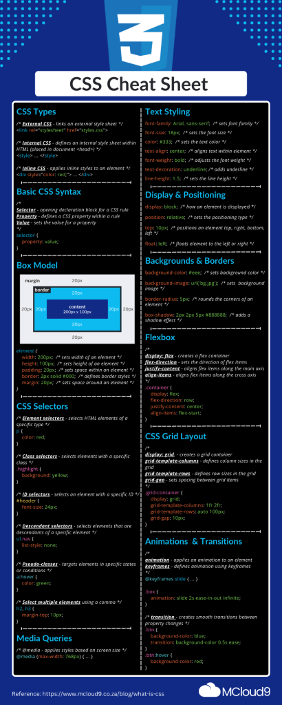
CSS Cheat Sheet Infographic
Browser Support: Ensuring Cross-Compatibility
One of the challenges with designing websites is ensuring that your beautifully crafted styles appear consistently across different web browsers. While modern browsers have made significant strides in supporting CSS standards, there can still be variations in how they interpret and render styles. This can lead to discrepancies in your design, causing frustration for users.
Fortunately, CSS enjoys widespread support among major browsers like Chrome, Firefox, Safari, and Edge. However, it’s essential to be aware of potential compatibility issues and adopt best practices to ensure a seamless experience for your users.
One effective approach is to use CSS prefixes, also known as vendor prefixes. These are specific prefixes added to CSS properties to ensure compatibility with different browser engines. For example, to use the border-radius property with maximum compatibility, you would write:
.element {
  -webkit-border-radius: 10px;
  -moz-border-radius: 10px;
  border-radius: 10px;
}
By including prefixes, you can maximise browser compatibility and ensure that your styles appear as intended on various platforms.
FAQ for What Is CSS
What is CSS?
CSS stands for Cascading Style Sheets, which is a style sheet language used to determine the visual presentation of web pages. It is used to style HTML elements and make web pages presentable.
Who developed CSS?
CSS was developed by the World Wide Web Consortium (W3C) and is maintained by the CSS Working Group.
How can I learn CSS?
There are various resources available to learn CSS, including online tutorials, video tutorials, and books. Starting with a CSS tutorial is a great way to begin learning the basics.
What are the key features of CSS?
CSS features include the ability to control font size, background colour, borders, spacing, and positioning of elements on a webpage. It also allows for the creation of responsive designs for different devices.
What is the fastest way to handle CSS?
One way to handle CSS more efficiently is by using an external stylesheet. By linking to an external file, you can apply the CSS rules to multiple webpages without duplicating the code.
In Conclusion
Congratulations! You’ve embarked on a journey to master the art of Cascading Style Sheets, the design language that brings life to your webpages. From understanding the fundamental concepts to exploring modern features like Flexbox and Grid Layout, you now have the knowledge to explore and create visually captivating and responsive designs.
Remember, CSS is not just about aesthetics – it’s about crafting a user-friendly and engaging experience for your audience. By implementing the techniques and strategies outlined in this guide, you’ll be well-equipped to take your design skills to the next level.
As you continue to hone your skills, MCloud9, a leading web hosting and domain registration company, is here to support your journey. Our reliable hosting services ensure that your websites are accessible to users around the clock, while our user-friendly interfaces make managing your online presence a breeze.
So go ahead, experiment, create, and transform your web pages into works of art that leave a lasting impression. With CSS as your creative palette, the possibilities are endless. Happy designing!
