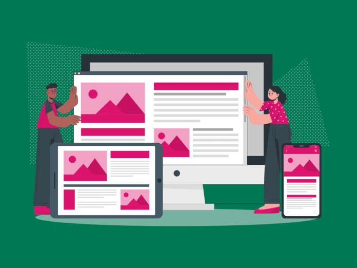
Today, creating a seamless user experience across various devices is essential. Mobile devices accounted for 59.45% of internet usage in 2023. This emphasises the growing importance of responsive design. Let’s dive into the enchanting world of CSS media queries, a powerful tool that can transform your websites into responsive wonders. Media queries are your trusty companions on the quest for responsive web design. But what exactly is responsive design, and how do media queries fit into the equation?
Table of Contents
What Is Responsive Design?
Responsive design is the art of crafting websites that adapt gracefully to the user’s device, providing an optimal viewing experience. Whether your audience is on a desktop, tablet, or mobile device, your site should look and function flawlessly. Here’s where media queries come into play, casting their responsive spell to ensure your website dazzles on every screen.
What Is a Media Query?
Think of a media query as a set of instructions that tell the browser how to style your content based on certain conditions. These conditions, or media features, could include the width of the viewport, the type of device, or even the screen resolution. By using media queries, you can conjure up a design that seamlessly adapts to the user’s environment.
Understanding Viewports
Ah, the mystical viewports – the windows into your enchanted web world. Understanding them is crucial for mastering responsive design. The viewport is the visible area of a webpage, and media queries use this knowledge to apply styles based on the user’s viewport dimensions, namely the viewport width. Now, let’s explore the basic syntax of a media query.
Basic Syntax of a Media Query
Let’s unravel the basic CSS syntax of a media query instruction. It starts with the @media rule, followed by a media type or media feature. For example:
@media screen and (max-width: 600px) {
  body {
    background-color: steelblue;
  }
}
This CSS snippet targets screens with a maximum width of 600 pixels and sets the page’s body background colour to ‘steelblue.’
Now that we’ve introduced the @media rule, let’s explore the practical side of media queries by understanding the difference between min-width and max-width. These are essential conditions that determine when your styles should be applied based on the width of the viewport.
min-width: This condition triggers the application of your styles if the viewport’s width is equal to or exceeds the specified value. It’s like saying, “Apply these styles when the viewport is at least this wide.”
@media screen and (min-width: 768px) {
  /* Styles for wider screens go here! */
}
In this example, the styles inside the media query will only take effect on screens with a width of 768 pixels or more.
max-width: Conversely, this condition instructs the browser to apply your styles until the viewport’s width surpasses the specified value. It’s akin to saying, “Use these styles until the viewport is this wide.”
@media screen and (max-width: 767px) {
  /* Styles for smaller screens go here! */
}
Here, the styles will only be applied to screens with a width of 767 pixels or less. Beyond that, the specified styles won’t be in effect.
Choosing between these two conditions enables you to create responsive designs that smoothly adapt to different screen sizes. It’s a practical approach to ensuring your website looks good on screens of all dimensions. Experiment with these conditions, find the right balance, and soon you’ll be creating designs that cater to users across various devices.
Common Breakpoints for Responsive Layouts
Creating a responsive masterpiece requires careful consideration of breakpoints – specific widths where your design gracefully shifts to accommodate different screen sizes. Here are some common breakpoints to guide your magical creations:
- Desktop: 1200px and above
- Tablet (Landscape): 1024 to 1199px
- Tablet (Portrait): 768px to 1023px
- Mobile: 767px and below
These breakpoints ensure your design flexes and flows seamlessly.
CSS Media Query Examples
Now, let’s get our hands dirty with some CSS media query examples. Picture this: you want to tweak the font style on different-size screens. Here’s how the magic happens:
/* Default Styles for All Viewports */
body {
  font-size: 16px;
  line-height: 1.5;
}

/* Styles for Screens up to 767px (Mobile) */
@media screen and (max-width: 767px) {
  body {
    font-size: 14px;
    line-height: 1.3;
  }
}

/* Styles for Screens 768px to 1023px (Tablet Portrait) */
@media screen and (min-width: 768px) and (max-width: 1023px) {
  body {
    font-size: 18px;
    line-height: 1.6;
  }
}

/* Styles for Screens 1024px to 1199px (Tablet Landscape) */
@media screen and (min-width: 1024px) and (max-width: 1199px) {
  body {
    font-size: 20px;
    line-height: 1.7;
  }
}

/* Styles for Screens 1200px and Above (Desktop) */
@media screen and (min-width: 1200px) {
  body {
    font-size: 22px;
    line-height: 1.8;
  }
}
Voila! Your text now dances elegantly on different screens.
Responsive Web Design Best Practices
Crafting responsive wonders isn’t just about syntax and breakpoints; it’s an art. Here are some best practices to ensure your spells hit the mark:
- Mobile-First Approach: Start designing for mobile and progressively enhance for larger screens. This ensures a delightful experience for users on smaller devices.
- Flexbox and Grid: Embrace the power of CSS Flexbox and CSS Grid to create flexible and dynamic layouts that adapt effortlessly.
- Image Optimisation: Optimise images to keep your site running smoothly. No one likes a laggy incantation!
- Testing, Testing, 1-2-3: Test your responsive designs across various devices to ensure a consistent experience. MCloud9 offers reliable hosting services, providing the perfect stage for your testing.
Browser Support for Media Queries
Now that your queries are ready, let’s talk about browser support. Fortunately, most modern browsers embrace the magic of media queries. However, it’s always wise to double-check and sprinkle a bit of graceful degradation for those rare moments when ancient browsers wander into your enchanted forest.
FAQ for Media Queries
What are media queries?
Media queries are a feature of modern web design that enables the presentation of different styles for different devices and screen resolutions. They allow the web page to adapt and respond to various conditions, such as screen width, device orientation, and resolution.
Can media queries be used for more than one condition?
Yes, media queries can be used for more than one condition by combining multiple media features and expressions. This allows developers to create complex media queries to target specific devices or screen dimensions.
What are some common tools and resources for learning about media queries?
Some common tools and resources for learning about media queries include HTML and CSS tutorials on platforms like W3Schools and MDN Web Docs, as well as frameworks like Bootstrap, which provide built-in support for responsive design and media queries.
In Conclusion
There you have it, a comprehensive guide to the magic of CSS media queries. With these techniques in your arsenal, you can create websites that captivate users on any device. Remember, the key is to experiment, test, and let your creativity soar.
Remember, responsive design is a thoughtful blend of strategy and code. By strategically placing breakpoints and utilising media queries, you ensure your digital creations look stellar across the vast landscape of devices.
As you embark on your responsive journey, consider the importance of reliable hosting. MCloud9 stands as a stalwart companion, providing secure and seamless hosting services for your web endeavours. Our robust platform is the perfect stage for testing and deploying your responsive designs.
